Key Takeaways
- A SaaS landing page must align traffic intent, messaging, proof, and conversion goals.
- Clear outcome-focused headlines help visitors understand the product and its value quickly.
- Relevant social proof builds confidence before visitors book demos or start trials.
- Focused CTAs and shorter forms reduce friction and improve qualified conversions.
- Continuous CRO testing turns landing pages into stronger pipeline and revenue drivers.
Why SaaS Landing Pages Need Strategy, Not Just Design
A polished design can attract attention, but it cannot fix unclear messaging, weak positioning, or poor traffic alignment.
SaaS landing pages convert when every element supports one clear goal. The headline must match visitor intent, the copy must explain value, the proof must build trust, and the CTA must feel relevant.
Without this alignment, even a visually impressive page may lose qualified prospects. Strong strategy turns design into a focused path from interest to demos, trials, and pipeline.
This guide shows you how.
What Is a SaaS Landing Page?
A SaaS landing page is a focused web page created to move visitors toward one primary action.
That action might be:
- Booking a product demo
- Starting a free trial
- Creating an account
- Requesting pricing
- Joining a waitlist
- Downloading a resource
- Submitting a lead form
A regular website page may introduce several services, products, audiences, and ideas. A landing page has a narrower responsibility.
It speaks to a particular visitor, presents a relevant offer, and makes the next step clear.
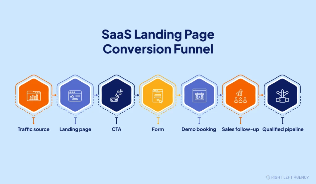
SaaS Landing Page vs. Homepage
A homepage has to serve many people.
Potential buyers visit alongside current users, job applicants, partners, investors, and reporters. This diversity of visitors is why the homepage contains a lot of navigation, many messages, and several conversion opportunities.
The landing page gets rid of all this clutter.
For instance, the SaaS Analytics homepage can feature reporting, attribution, integrations, dashboards, and data management. A campaign landing page might just be about B2B SaaS marketers who wish to link their marketing efforts to the revenue pipeline.
The product remains the same. The message becomes more specific.
SaaS Landing Page vs. Product Page
A product page explains the platform as a whole. It usually covers the product’s core features, use cases, benefits, integrations, pricing direction, and overall value proposition.
A landing page focuses on a smaller, more specific part of that story. It may target one feature, use case, industry, integration, campaign, or customer problem.
For example, a product page might introduce a complete customer support platform. A feature landing page might focus only on how support teams can automate ticket routing.
SaaS Landing Page vs. Demo Page
A SaaS landing page can support different goals, such as promoting a feature, targeting a use case, generating trial signups, or converting campaign traffic.
A demo page has a narrower purpose. It targets high-intent visitors who are considering a conversation with the sales team.
It should explain who the demo is for, what the visitor will learn, how long it will take, and what happens after booking. The goal is to make the demo feel relevant, valuable, and worth the prospect’s time.
Here’s how each page type compares at a glance:
| Page Type | Main Purpose | Typical Visitor | Primary CTA |
|---|---|---|---|
| Homepage | Introduce the business | Mixed audience | Explore the product |
| Product page | Explain the platform | Product-aware visitor | Start a trial |
| Campaign landing page | Convert targeted traffic | Intent-specific visitor | Offer-based CTA |
| Demo page | Generate sales conversations | High-intent buyer | Book a demo |
Why SaaS Landing Page Strategy Matters for Trial Signups
Driving traffic is only the first step. The landing page still has to turn that interest into a trial signup.
When the message feels unclear, the offer does not match visitor intent, or the signup process creates too much friction, even good-fit prospects leave.
A strong SaaS landing page strategy helps you:
- Convert more paid and organic traffic
- Lower customer acquisition costs
- Improve paid media efficiency
- Attract better-fit users
- Reduce wasted clicks and abandoned signups
- Build more qualified pipeline
Trial quality matters as much as trial volume. A large number of low-fit signups can increase onboarding costs without improving revenue.
The right landing page makes the product’s value clear, builds confidence quickly, and gives visitors a simple path to start. This helps SaaS companies generate more qualified trials without increasing ad spend.
Build the Landing Page Around the SaaS Funnel
A SaaS landing page works best when it matches the funnel behind it. Before writing copy or designing sections, decide whether the page supports self-serve signups, demo bookings, lead magnet opt-ins, or a hybrid path. Use the table below to choose your funnel type; the page-type breakdown further down maps that funnel to specific page formats and CTAs.
| Funnel Type | Best For | Primary CTA | Page Requirement |
|---|---|---|---|
| Self-serve signup | PLG SaaS, low-friction tools | Start free trial / Create account | Short page, clear value, low signup friction |
| Demo funnel | Sales-led SaaS, complex products | Book a demo | More proof, objection handling, qualification |
| Lead magnet funnel | Cold or early-stage traffic | Download guide / Get checklist | Immediate value, education, nurture path |
| Hybrid funnel | SaaS with both PLG and sales motions | Start trial + Book demo | Clear CTA hierarchy, audience segmentation |
Product-Led SaaS Landing Pages
A product-led page should help visitors move from interest to product experience quickly.
The page still needs strong positioning and proof. However, it should avoid turning a simple signup into a lengthy sales process.
Visitors usually need to understand:
- What the product helps them accomplish
- How quickly they can start
- Whether payment details are required
- What happens after signup
- How soon they can experience value
Helpful support copy might include:
- No credit card required
- Start with a free account
- Setup takes less than five minutes
- Cancel whenever you need
The page should make starting feel easier than continuing with the current problem.
Sales-Led SaaS Landing Pages
Sales-led products often require more explanation.
The price may be higher. Implementation may take longer. Several people may influence the buying decision. Security, integrations, data migration, and onboarding may all matter.
These pages should provide enough context to make the demo worthwhile.
A sales-led landing page may need to explain:
- The business problem
- The cost of leaving it unresolved
- The product’s main outcome
- Relevant use cases
- Customer results
- Integration compatibility
- Security or compliance requirements
- What the demo will cover
The CTA should sell the value of the conversation, not merely ask the visitor to “contact sales.”
Hybrid SaaS Landing Pages
Some SaaS companies offer both self-service access and sales support.
In that case, the landing page needs one clear priority.
For example:
- Primary CTA: Start Free Trial
- Secondary CTA: Talk to Sales
The secondary action should remain visible without competing with the main conversion goal.
Too many equal CTAs create hesitation. Visitors stop deciding whether the product is useful and start deciding which button they are supposed to press.
Types of SaaS Landing Pages and When to Use Each
Different SaaS landing pages serve different buying intents. A demo page, a trial signup page, and a paid ad landing page shouldn’t share the same structure or CTA strategy.
| Landing Page Type | Funnel Intent | Best CTA | Key Sections |
|---|---|---|---|
| Demo landing page | High-intent, sales-led | Book a demo | Proof, objections, qualification |
| Free trial page | Product-led, self-serve | Start free trial | Fast value, low friction |
| Feature page | Consideration stage | Learn more / Try it | Use case, specific benefit |
| Comparison page | Late consideration | See why teams switch | Head-to-head table, proof |
| Paid ad page | Campaign-specific | Matches ad promise | Tight message match, fast load |
| Webinar page | Education/nurture | Save my seat | Speaker credibility, agenda |
| Lead magnet page | Early-stage, cold | Download guide | Value preview, low-friction form |
| Waitlist page | Pre-launch | Join the waitlist | — |
The SaaS Landing Page Strategy Framework
A strong SaaS landing page strategy starts before design. Define the audience, traffic source, offer, conversion goal, proof assets, CTA path, and follow-up process first.
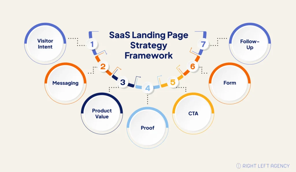
Match the Page to Visitor Intent
Visitors arrive with different levels of awareness, urgency, and product knowledge. Someone clicking a Google Ad may already be searching for a solution, while a visitor from LinkedIn may still be learning about the problem.
This step aligns the page with the traffic source and the visitor’s stage in the buying journey. It helps you choose the right message, proof, page length, and CTA for paid search, paid social, SEO, retargeting, or email traffic.
Define One Primary Conversion Goal
A landing page becomes harder to follow when several actions compete for attention. Visitors may hesitate when they must choose between booking a demo, starting a trial, viewing pricing, or downloading a guide.
This step gives the page one clear purpose. Every section then supports the same primary action, such as booking a demo or starting a free trial.
Clarify the ICP and Pain Point
Visitors need to know quickly whether the product fits their role, company, use case, or problem. Broad messaging often attracts weak-fit leads and loses qualified prospects.
This step makes the ideal customer profile and core pain point clear above the fold. It helps the right visitors recognize their situation and understand why the product is relevant.
Lead With Outcome-Based Messaging
Technical features may explain what the product does, but they do not always show why the product matters. Buyers care more about the time saved, revenue gained, risk reduced, or process improved.
This step translates product capabilities into practical business outcomes. It helps visitors understand the value before asking them to study detailed features.
Build Credibility Before Asking for Action
Visitors may understand the offer and still hesitate because they do not trust the company or its claims. This hesitation becomes stronger with cold traffic and unfamiliar SaaS brands.
This step introduces proof early through customer logos, testimonials, case studies, review ratings, security signals, or measurable results. It reduces uncertainty before the visitor reaches the CTA or form.
Reduce Form and CTA Friction
Long forms, vague buttons, and unclear next steps create unnecessary friction. Every extra field or unanswered question gives visitors another reason to leave.
This step simplifies the conversion path by using specific CTA copy, requesting only essential information, and explaining what the visitor will receive after taking action. Practical form tactics are covered in more detail later in this guide.
Align Follow-Up With the Page Promise
The landing page experience does not end after submission. A slow response, confusing confirmation message, or irrelevant sales call can weaken the trust the page worked to build.
This step connects the page promise with the post-conversion journey. Confirmation emails, calendar booking, lead routing, sales follow-up, and onboarding should all reflect what the visitor expected before submitting the form.
SaaS Landing Page Structure That Converts
A high-converting SaaS landing page follows a logical decision path: a clear benefit, proof to back it up, an explanation of the product, objection handling, an easy next step, and a direct CTA.
A typical page flow looks like this:
- Simple navigation
- Benefit-driven hero section with primary and secondary CTA
- Above-the-fold social proof
- Problem and pain-point section
- Product/value explanation
- Benefit-led feature section
- How-it-works section
- Use-case or audience-specific section
- Product screenshots or demo visuals
- Testimonials, logos, or case studies
- Objection-handling section
- Demo or lead capture form
- FAQ section
- Final CTA section
This isn’t a rigid template. Page length and section depth should flex based on product complexity, buyer awareness, offer risk, and traffic source.
This decision-focused structure also supports high-converting B2B landing pages, especially for complex products with longer sales cycles.
Write a Hero Section That Passes the Five-Second Test
The hero section should answer five questions quickly:
- What is the product?
- Who is it for?
- What problem does it solve?
- What outcome does it create?
- What should the visitor do next?
Write an Outcome-Based Headline
Avoid clever claims that hide the product’s value.
Weak:
Powerful Analytics for Modern Teams
Better:
See Which Campaigns Create Pipeline Without Manual Reporting
The stronger headline communicates a result and removes vague language.
Use the Subheadline to Add Context
The subheadline should explain how the product delivers the outcome.
For example:
“Connect paid, organic, and CRM data in one reporting workspace built for B2B SaaS marketing teams.”
The headline creates interest. The subheadline removes confusion.
Place Proof Near the CTA
Strong proof near the CTA might be a customer logo, a short testimonial, a usage statistic, or a security statement — the full range of credibility assets is covered in more detail later in this guide.
Do not use unrelated logos only because the brands look impressive. Relevance matters more than recognition.
Show the Product Clearly
Use a clean screenshot, short GIF, cropped mockup, or brief walkthrough.
Avoid placing a full dashboard inside a small laptop frame when visitors cannot read or understand it.
Show one valuable workflow at a time.
Align the Ad, Offer, and Landing Page Message
Ad-to-page message match means the landing page continues the same promise, pain point, audience, and offer that generated the click.
Suppose a LinkedIn ad promotes:
“Automated revenue reporting for B2B SaaS demand generation teams.”
Sending that traffic to a generic analytics homepage weakens the experience.
The landing page should continue the message through:
- A matching headline
- Relevant product visuals
- Demand generation use cases
- SaaS customer proof
- A focused demo CTA
Search traffic also requires message match.
Someone searching for a SaaS reporting alternative expects comparison information. Someone searching for a free trial expects fast access.
The landing page should respect that expectation.
Prioritize Copy Before Design
Design supports conversion by creating clarity, focus, and credibility.
Copy creates the buying argument.
Strong landing page copy should explain:
- The buyer’s problem
- The cost of leaving it unresolved
- The desired outcome
- How the product helps
- Why the claim is credible
- What the visitor should do next
Use buyer language from real conversations.
Sales calls, demo recordings, support tickets, reviews, live chat logs, and lost-deal notes are full of the exact phrases buyers use.
Translate features into outcomes
Never list a capability without explaining why it matters to the reader.
Use a problem-impact-solution-outcome structure
Show the pain, explain the cost of inaction, introduce the product, then clarify the improved state.
Use AI for research, not full copywriting
AI can help analyze call transcripts and brainstorm variations, but strong SaaS copy still needs buyer insight and positioning judgment that only a strategist brings.
Build Credibility Before Asking for a Demo
SaaS buyers need confidence before they book a demo, start a trial, or submit a form. The page has to prove the product works, the company is trustworthy, and similar customers have gotten real results.
Credibility assets worth including:
- Customer logos
- Role-specific testimonials
- Case studies
- G2, Capterra, or TrustRadius ratings
- Security badges (SOC 2, GDPR, ISO where relevant)
- Integration logos
- Usage stats and performance metrics
- ROI proof and customer success stories
Match the proof to the ICP. A testimonial from a similar customer carries far more weight than a generic quote from an unrelated user.
Use CTA Strategy Based on Funnel Intent
A SaaS CTA should match the visitor’s readiness. A cold visitor might need to watch a product tour first, while a high-intent visitor is ready to book a demo immediately.
| Funnel Stage | Better CTA Style | Example |
|---|---|---|
| Awareness | Learn / See / Watch | “See how it works” |
| Consideration | Compare / Explore | “View customer results” |
| Trial intent | Start / Create | “Start free trial” |
| Demo intent | Book / Request | “Book a demo” |
| Pricing intent | Choose / Talk | “Talk to sales” |
| Pre-launch | Join / Get | “Join the waitlist” |
A few CTA rules hold across almost every SaaS page: add a secondary CTA only when it genuinely supports the decision path, repeat CTAs after high-intent sections, add short support copy near the button, and avoid generic labels like “Submit” or “Click here.”
How to Increase Form Submission Rates on SaaS Landing Pages
To increase form submissions, reduce unnecessary fields, clarify what happens after submission, place forms near high-intent sections, and add trust copy that makes the next step feel safe.
Match form length to intent. A free trial form should be short. A demo form can ask a few qualification questions, but only if those questions actually improve routing or lead quality.
Use CTA support copy near the form. Lines like “No credit card required,” “Setup takes less than 5 minutes,” or “We’ll reply within one business day” lower perceived risk.
Clarify the post-submit experience. Tell visitors exactly what happens after they book a demo or submit the form.
Test multi-step forms carefully. They can reduce perceived friction, but shouldn’t hide how much effort is actually required.
Connect the form to lead routing. Mention CRM integration, sales handoff, speed-to-lead, calendar booking, and confirmation emails so the experience feels seamless end to end.
Optimize Product Visuals Without Slowing the Page
SaaS product visuals should make the product easier to understand — not overwhelm visitors or slow the page down. Use clean screenshots, cropped mockups, GIFs, or short videos that show one important workflow at a time.
A few practical guardrails:
- Avoid raw, full-dashboard screenshots.
- Use visuals that support the specific message of that section.
- Compress images and videos, and use WebP where possible.
- Avoid heavy interactive demos on paid ad pages if they slow load speed.
- Always check above-the-fold clarity on mobile.
Optimize the Post-Conversion Success Page
The success page isn’t just a thank-you message. It can confirm the action, reduce uncertainty, improve tracking, prepare prospects for the sales call, and keep building trust after conversion.
A strong success page includes:
- A clear confirmation message
- What happens next
- Calendar details or meeting expectations
- A short product video
- FAQs before the call
- A case study link
- Tracking event confirmation
- An optional secondary action
Many landing page guides stop at the click and ignore this step entirely, which makes it an easy place for your team to stand out.
How to Analyze a SaaS Landing Page Before Redesigning It
Before redesigning a SaaS landing page, diagnose where the conversion problem actually happens. Low conversions can come from poor traffic quality, weak message match, an unclear offer, missing proof, or form friction — and each has a different fix.
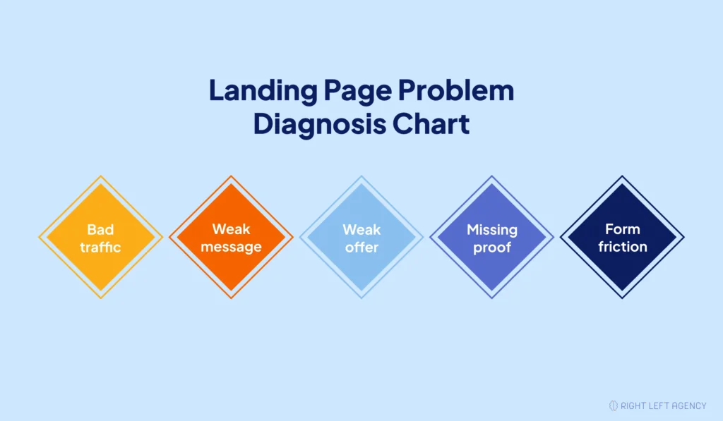
| Problem Type | What It Looks Like | What to Check |
|---|---|---|
| Bad traffic | High bounce, low engagement | Audience, channel, keyword, ad targeting |
| Weak message | Visitors don’t understand the offer | Hero copy, ICP clarity, value proposition |
| Weak offer | Visitors understand but don’t click | CTA, incentive, perceived value |
| Missing proof | Visitors hesitate before acting | Testimonials, logos, case studies, trust signals |
| Form friction | Visitors click but abandon the form | Form fields, calendar flow, page speed, mobile UX |
Tools like Google Analytics, Google Tag Manager, Hotjar, Microsoft Clarity, scroll maps, click tracking, and session recordings can help pinpoint exactly where visitors drop off.
Use CRO to Improve the Page After Launch
A SaaS landing page launch is only the starting point. Teams should use A/B testing, split testing, analytics, customer feedback, and lead-quality data to keep improving the page over time.
A/B Test Focused Elements
Test:
- Headlines
- CTA wording
- Form microcopy
- Hero visuals
- Proof placement
- Offer positioning
Split Test Larger Experiences
Test:
- Page length
- Section order
- Form placement
- Product visual placement
- Demo-first versus trial-first paths
- Different audience positioning
Measure More Than Conversion Rate
A variation can generate more forms while reducing lead quality.
Track:
- Qualified demo rate
- Demo attendance
- Lead-to-opportunity rate
- Demo-to-close rate
- Customer acquisition cost
- Pipeline generated
- Revenue influenced
The strongest page creates valuable business outcomes, not only more clicks.
Improve Low-Traffic Pages Strategically
Low traffic does not make CRO useless.
Prioritize meaningful changes such as:
- Clearer positioning
- Stronger offer
- Better proof
- Shorter form
- Improved CTA
- Better message match
Avoid testing several minor visual changes at once.
Common SaaS Landing Page Mistakes
Most SaaS landing page mistakes happen when the page is built around internal product features instead of visitor intent, business outcomes, trust, and conversion friction.
Watch out for:
- A vague headline
- Weak ICP clarity
- Too many competing CTAs
- Feature-heavy copy with no outcomes
- Missing or generic social proof
- No real product visuals
- Long, high-friction forms
- Poor mobile layout or slow page speed
- Weak ad-to-page message match
- No objection handling
- No clarity on what happens after submission
- No lead routing or follow-up process
- Testing visual details before fixing strategy
Example: Optimizing a SaaS Demo Landing Page
A SaaS demo landing page should make the demo feel specific, valuable, and low-risk. Visitors need to know who the demo is for, what they’ll learn, why the product is credible, and what happens after booking.
| Element | Weak Version | Better Version |
|---|---|---|
| Headline | Powerful Analytics for Modern Teams | See Which Campaigns Create Pipeline Without Manual Reporting |
| Subheadline | All Your Data in One Place | Connect Paid, Organic, and CRM Data in One Reporting Workspace |
| CTA | Submit | Book a 20-Minute Demo |
| Proof | Generic testimonial | Testimonial from a SaaS demand generation leader |
| Visual | Full dashboard screenshot | Cropped campaign-to-pipeline workflow |
| Form | Nine required fields | Four required fields and one optional question |
| Follow-up | No explanation | Clear demo agenda and confirmation email |
The improved version clarifies the audience, problem, outcome, proof, and next step.
That is the foundation of effective B2B landing page optimization.
SaaS Landing Page Checklist
Use this checklist to audit whether your SaaS landing page has the right message, structure, proof, CTA, form experience, and tracking setup before sending more traffic to it.
- Is the target audience clear above the fold?
- Does the headline explain a specific outcome?
- Does the subheadline clarify the product?
- Is there one primary CTA?
- Is the secondary CTA useful, not distracting?
- Does the page match the traffic source?
- Is proof visible early?
- Are testimonials specific and credible?
- Are product visuals easy to understand?
- Are features translated into benefits?
- Is the form short enough for the funnel stage?
- Does the page explain what happens after submission?
- Is the page fast on mobile?
- Are CTA clicks and form events tracked?
- Is the thank-you page optimized?
- Is there a CRO testing plan in place?
Once each item on this checklist is addressed, the page is ready to be treated not just as a design deliverable, but as part of a larger system.
Treat Your SaaS Landing Page Like a Revenue System
A SaaS landing page shouldn’t be treated as a one-time design project. It’s a revenue system that connects traffic intent, messaging, proof, CTA strategy, form experience, follow-up, and ongoing CRO improvement. Get any one piece wrong, and qualified demand leaks out before it ever reaches sales.
Need help turning more SaaS landing page traffic into qualified demos?
Right Left Agency can help you audit, restructure, and optimize your landing pages for stronger conversion and pipeline outcomes.
Explore Landing Page Optimization for B2B Companies
Frequently Asked Questions
What is a SaaS landing page?
A SaaS landing page is a focused page designed to convert software visitors into one primary action, such as booking a demo, starting a free trial, joining a waitlist, or submitting a form.
What is the best landing page structure for SaaS?
The best structure usually includes a clear hero, primary CTA, early proof, problem framing, product value, benefit-led features, product visuals, customer evidence, objections, FAQs, form, and final CTA.
What makes a SaaS landing page convert?
A SaaS landing page converts when it matches visitor intent, explains the product clearly, communicates a valuable outcome, provides relevant proof, reduces friction, and gives visitors one obvious next step.
How do you improve landing page conversion for SaaS?
Improve conversion by strengthening the hero message, clarifying the target audience, matching the traffic source, improving proof, reducing form friction, optimizing mobile speed, and testing important page elements.
How can SaaS companies increase form submissions?
Reduce unnecessary fields, use clear CTA copy, add trust-building microcopy, explain what happens after submission, improve form placement, and test the complete booking or signup flow.
Should SaaS landing pages include pricing?
It depends on the page type and visitor intent.
Homepage and pricing-intent pages should usually make pricing accessible. Dedicated campaign pages should test whether visible pricing improves conversion quality or creates objections before the value becomes clear.
Should SaaS landing pages have multiple CTAs?
They should have one primary CTA.
A secondary CTA can support visitors who need more information, such as a product tour, case study, comparison, or customer results page.
How often should SaaS landing pages be tested?
Teams should review landing page performance continuously.
High-traffic pages can run regular experiments. Low-traffic pages should focus on high-impact changes involving positioning, messaging, proof, offers, CTAs, and forms.